Filed under: Exquisite Reviews | Tags: Black Magick, Chiara Arena, Eric Trautmann, greg rucka, Image Comics, Jodi Wynne, Nicola Scott, Portsmouth. Image Comics, Rowan Black
Art by Nicola Scott
Colour Assists by Chiara Arena
Letters by Jodi Wynne
Book and Logo Design by Eric Trautmann
Published by Image
£2.85
It’s not easy to be surprised these days, especially with fiction. We live in such a hyper-aware time, where context and research are just a tap of a piece of internet away, that we go into most stuff pre-warned. It’s good, in a lot of ways. It means we can understand the roots of a story and through that the story itself.
I do miss being surprised sometimes though. Which is why I liked Black Magick so much. Because, in the space of an issue, it managed to surprise me twice.
And no, I’m not telling you how. Where would the fun be in that?
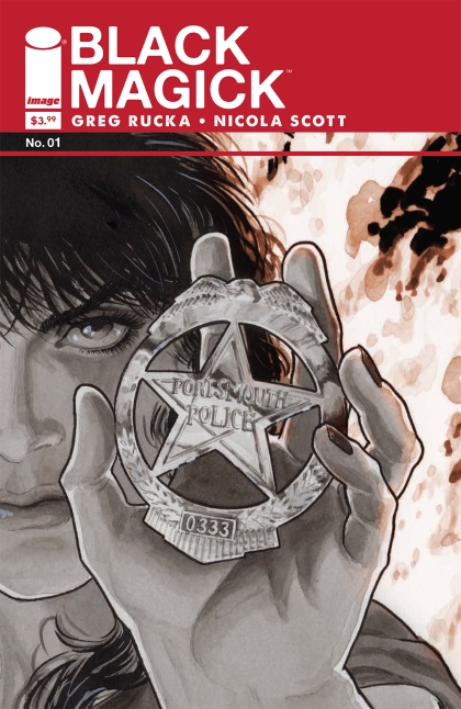
Instead I’ll tell you this. Rucka’s script doesn’t so much open in media res as in media average week night. Detective Rowan Black, the lead, is a smart, driven homicide detective for Portsmouth PD who gets a call she was not expecting. A hostage situation where she’s been requested by name. As Rowan digs deeper, she, and we, begin to realize the truth. That Portsmouth is a very old town with very old ideas and some of them have decided to crawl out into the light.
Rucka combines police procedural and horror in a way so logical it feels like chocolate and peanut butter. Rowan’s life is like ours; packed, complex, compartmentalized. The only difference is she’s not safe in any of those compartments and as the issue closes she realizes that. It’s crucial as well to point out that Rowan is never a victim here either. She’s a very smart, skilled, competent police officer who finds herself in a situation she was not expecting. The series, in the short term, looks to explore what she does. In the long term, it’s going to explore why she has to do it. I’ll be on board for both.
Especially as the art here is phenomenal. Seriously, if you have issues with black and white then get this issue with black and white art and get over them. Scott’s work is staggeringly great, detail heavy but always light of touch and crammed full of atmosphere. The first page alone will sell you on the book. Huge, forbidding pines; moonlight, a lone hooded figure. But there’s so much more here, all of it grounded and real and all the more horrifying for it. Scott and the great colour assist from Arena will be in the running for awards here and deservedly so. Likewise Wynne’s lettering is subtle, clever and communicates as much information as every other element of the book, just with even more subtlety.
This is one of the best first issues you’ll read this year. Endlessly clever, endlessly confident and an absolute must read.
Leave a Comment so far
Leave a comment
