Filed under: Exquisite Reviews | Tags: Adam Kubert, alex ross, Captain America, Cory Petit, David Mccaig, Iron Man, Mahmud Asrar, Mark Waid, Ms. Marvel, Nova, Sonia Oback, Spider-Man, Thor, Vision
 Written by Mark Waid
Art by Adam Kubert
Colour art by Sonia Oback
Letters by VC’s Cory Petit
Cover by Alex Ross
Published by Marvel
‘You’re a Jerk!’
Written by Mark Waid
Art by Mahmud Asrar
Colour art by David Mccaig
Letters by VC’s Cory Petit
£3.60
With a team like that on the book, not to mention a team like this IN the book, most of you will be inclined to pick this up without any words from me.
Go do it, it’s GREAT.
Need convincing anyway? Okay. Waid gets these characters on a level few other authors do. The absolutely killer cold open confirms that, but it’s the interplay between Sam and Tony that will sell you. One is a man wearing the shoes of a mentor he’s estranged from, the other is…well…kind of broke right now. Both of them are starting from zero and Waid cleverly sets up a playful friendship between the two that’s very different to that between Steve and Tony. It’s closer in tone to the Ollie/Hal ‘Hard travelling heroes’ era from DC. Two guys, both with lots to prove, both with little to rely on but each other.
That need for these characters to do something bigger than them looks to be the foundation stone of this new team. Along with that other classic Avengers motivation; crisis management. Waid cleverly folds the aftermath of Secret Wars into the story, giving the characters a motivation, foe and serious problems all in the space of a few pages. He also hands us the single best Iron Man suitup sequence you’ll see in comics this year. All of which is presented with precision, subtle colouring by Oback and almost casually impressive detail by Kubert. This really is a ludicrously good looking book with plenty of narrative muscle under the hood.
But the story that stays with you is the backup. On paper it’s deceptively simple; Nova tracks a monster to Jersey City, Ms Marvel helps out, they bicker. What makes it brilliant is the way Waid refuses to back down from the hormonal apocalypse that is adolescence. These are arguably the two sweetest natured characters in the Marvel universe right now and they do almost nothing but piss each other off even as they’re frantically trying to do ANYTHING ELSE. It’s an incredibly accurate account of teenage horror, and the chemistry between the two is all the sweeter for how vastly bad they both are at it. Plus Asrar’s art is just flat out stunning. It’s got an open, friendly quality to it but with clever character work that Mccaig’s colour work really helps bring out and Petit’s letters land with crushing accuracy. You will cringe at how badly these kids mess up around each other. I certainly did.
Another strong entry in the relaunched Avengers titles, this has buckets of heart, a ton of humour and gets a lot done in its first issue. Highly recommended.
Filed under: Exquisite Reviews, Uncategorized | Tags: Amanda Conner, DC, Emanuella Lupacchino, Harley Quinn, Hi-Fi, Jimmy Palmiotti, Ray McCarthy, Soren, Starfire, Tom Napolitano
 Written by Amanda Conner & Jimmy Palmiotti
Pencils by Emanuella Lupacchino
Inks by Ray McCarthy
Colours by Hi Fi
Letters by Tom Napolitano
Kori’s attempts to work out just what the Hell is going on with possible murderer Soren are hampered by what seems to be a sporadic new superpower. Not to mention a bounty hunter intent on claiming her life, and the prize attached to it…
Conner and Palmiotti are one of those writing teams that never get enough credit. Their work, for years now, has been characterized by a lightness of touch, love for the characters they’re writing and willingness to engage and listen to their audiences. They’re class acts who do their jobs supremely well, and this issue neatly demonstrates that.
What you’ve got here is three things happening at once. The Soren plot is moved along a little as we see just what he’s done, but remain unsure whether he knew he was doing it. That’s tied to Kori’s chaotic new ability which is itself a pretty interesting idea. Kori’s always been a character whose mind set has been a combination of sweet and brutal and the new ability touches on both those sides of her. It’s a forcible kind of empathy, one that gives her an idea of what her opponent’s done but denies her context. In doing so, it also challenges her fundamentally good nature. When faced with a murderer, whose crimes you’d experienced, what would you do? It’s a question with no easy answers and the book doesn’t shy away from that.
It also uses that dichotomy to deal with what would otherwise seem to be a fairly standard punch up. The bounty hunter who shows up is a charmingly cocky figure and Conner and Palmiotti cleverly use him as a means of catharsis, and questions, for both Kori and the reader. How she beats him, and what she does afterwards in particular, is an uneasy hybrid of both sides of her nature. She’s growing as a person and whether her actions here come back and bite her remain to be seen.
On the art side of things, Lupacchino’s clean lines mesh with the angle and panel choices of the script perfectly. Hi Fi’s colours give the book a convincingly sun drenched feeling that suits both its tone and the character and McCarthy’s inks are subtle but add welcome brawn to the art. Napolitano deals with lots of dialogue, and the interesting, staccato script structure, with aplomb too.
As clever, and fun, as Harley Quinn but a little quieter, Starfire is one of the best books DC put out right now. Fun, clever and, like Kori, far more complex than it first appears.
Filed under: Exquisite Reviews | Tags: Al Ewing, Black Panther, Blue Marvel, Captain Marvel, Dan Brown, Kenneth Rocafort, Marvel, Ms America, Spectrum, The Ultimates, Ultimates, VC's Joe Sabino
 Written by Al Ewing
Art by Kenneth Rocafort
Colour art by Dan Brown
Letters by VC’s Joe Sabino
Published by Marvel
£2.85
One of the several unsolvable problems of comics is stasis. Batman will never rid Gotham City of crime. Spider-Man will always do whatever a spider can. The worlds we see in superhero comics are vibrant, complex, rich and fundamentally unbreakable. The song may not remain the same, but the forms of the stories always do. Nothing changes. Or perhaps more accurately, nothing changes forever.
No one told the Ultimates that.
Al Ewing is one of the best writers in the business right now and every page of this issue shows you why. It’s loose, TV-like storytelling right down to the cold open and credits spaced through Rocafort’s big, expansive panels. It’s also a comic that trusts you completely. Inside the first few pages, Blue Marvel is talking about how the universe is built and what’s changed post-Secret Wars. Inside the first half issue we get an idea of the sheer scope of the team; T’Challa introducing the Secretary General of the UN to the Triskelin, Blue Marvel and Captain Marvel on a mission in deep space and Spectrum and Miss America on a second string of the same job, on a different world. All of them get moments to breathe and T’Challa, Captain Marvel and Spectrum come out particular well. They also play like a very different kind of team. There’s almost no conflict, no sense of warring personalities. This is a group of professionals, tackling the jobs no one else can. Changing things.
Big things.
Rocafort and Brown are on top form throughout here. I’ve talked already about the expansive panels but it’s the detail that stays with you. The look on Spectrum’s face as she sees just how powerful America Chavez really is. T’Challa’s good natured and relentless explanation of how the Triskelion is essential a science and superheroics nation state. Carol Danvers using an old identity for a new purpose and clearly enjoying it. And, of course, those final pages. This is a book about big ideas, filled with big personalities. It’s also absolutely confident in its mission, just like its characters. Because, and I’m being really careful not to spoil anything here, this book is going to change things. Or at least try.
Vast in scope and brilliantly executed this is one of the best debuts you’ll read this year. Rocafort and Brown’s art is note perfect, Sabino’s lettering is clever, playful and subtle and Ewing’s script is hugely ambitious and successful. Pick it up, meet the Ultimates and get ready for a brave new world, one they’re building one solution at a time.
Filed under: Exquisite Reviews | Tags: Annika, antony johnston, Codename Baboushka, Image Comics, Seamus, Shari Chankhamma, Simon Bowland
 Written by Antony Johnston
Art by Shari Chankhamma
Lettering by Simon Bowland
Published by Image
£2.85
Haven’t read the first issue? You should! Here’s my review telling you why!
The good news is that Baboushka is undercover on the Asian Paradise. The better news is that she’s one step closer to completing the op. The best news is Seamus Stirling is on board too.
The bad news is, so are a group of organized, disciplined pirates. Men who seem to know exactly what they’ve hijacked…
The second issue of this fantastic new action series kicks things into high gear two different ways. The action steps in pace and scale as Annika and Seamus find themselves remarkably unwilling hostages and that’s where Chankhamma’s work shines. Her character detailing is always great but this issue lets her cut loose with some glorious, flowing action that builds on last issue’s fight in a very clever way. Annika doesn’t just fight well, she’s smart and mean too. She uses people’s preconceptions about her against them, compensates for lack of mass with brutal efficiency and does everything right. The fight is only a small part of the issue but even so it’s used to build character. Better still, it emphasizes just how dangerous she is and just how few people know it. Plus, as the ending shows, all the training in the world doesn’t compensate for simple bad luck.
With Chankhamma’s brilliant art kicking the action up a gear, Johnston’s script does the same thing for the world. Seamus is a very welcome addition to the cast here, a suave, funny man who has clearly done very bad things and is, if not Annika’s equal, then is certainly a favourite sparring partner. Likewise, the cabal of criminal organizations Annika talks her way into not only progresses the plot but gives us an idea of the larger, shadowy world now part of. A world that, judging by this issue, is under serious threat.
Rounded out, as ever, by Bowland’s effortlessly smart lettering this is a highly impressive second chapter for one of the best action books on the market. Buy it, and find out just what Annika’s got planned. Or at least, what she says she has…
Filed under: Exquisite Reviews | Tags: Corto Maltese, Euro Comics, Hugo Pratt, IDW, Under the Sign of Capricorn
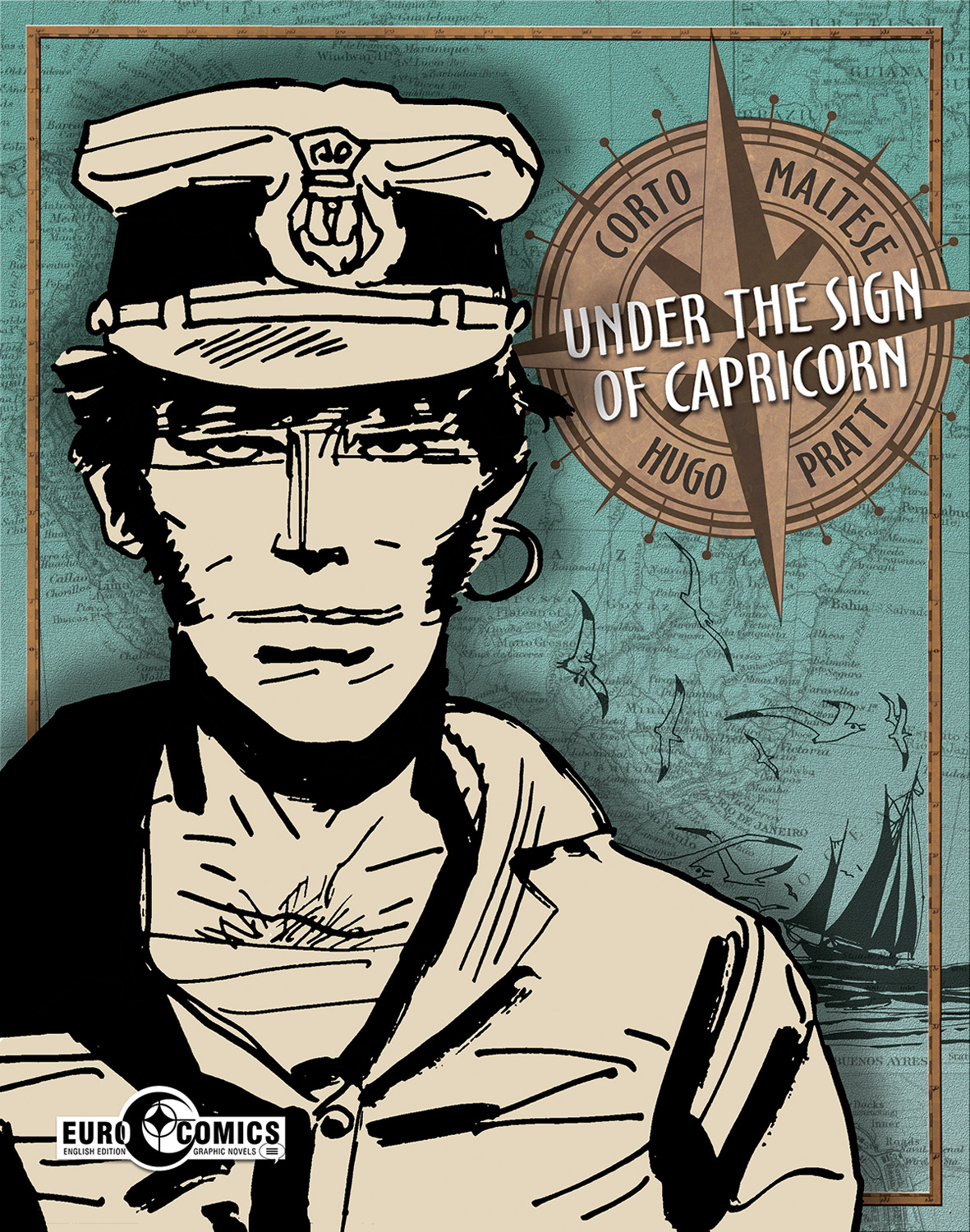 Written and drawn by Hugo Pratt
Published by IDW
£19.99
This is the first of a series of 12 volumes designed to bring Hugo Pratt’s classic story to the audience it richly deserves. Pratt pioneered comic storytelling, working years before Eisner, with this epic story of an adventurer, sailor and occasional thug. Principled, ruthless and strangely calm, Corto makes his way through a world of conspiracy, brutal murder and long forgotten history.
Think Raiders of the Lost Ark crossed with Uncharted and a rich streak of noir and you’ve got the tone here. Over the course of this book, Corto rescues an alcoholic academic from himself, aids a rich orphan intent on finding the other half of his family, postpones war and suffers serious head trauma. Oh he also loses a battle of wits with a Seagull in one of the bleakest, and funniest, shorts here.
Pratt’s hero is intensely laconic but he’s also a strangely poignant figure for reasons you’re drip fed through these stories. The ending of ‘The Seagull’s Fault’, the last and arguably best one here, is especially resonant. Seeing Corto do the right thing, again, lose everything, again and realize that turns out to be a surprisingly affecting read. The book’s full of moments like that.
Pratt’s art is, if anything, subtler than his writing. The bare minimum you need is on the page and a lot of the time it’s just whichever character happens to be talking. Despite this it never feels sparse, or phoned in. Pratt knew just what was needed and every page here is a textbook example of how to tell stories graphically. The fight scenes are especially well done, gritty and brutal but convincingly untidy and exhausting for the combatants.
This is a beautiful collection of one of comics’ many overlooked gems. It’s clever, occasionally dark, high adventure that’s been one of the foundations of an industry that had largely forgotten it for decades. Almost becoming the very kind of history Corto tries to plunder, it’s an all time classic and ripe for rediscovery.
Filed under: Exquisite Reviews | Tags: Comixology, Department of Monsterology, Gordon Rennie, Jang, Jim Campbell, Michael Calvary, Monsterology, PJ Holden, Professor Tovar, Renegade Arts Entertainment, Samwi, Steve Denton, Team Carnacki, Team Challenger
 Written by Gordon Rennie
Art by PJ Holden
Colours by Steve Denton
Letters by Jim Campbell
Published by Renegade Arts Entertainment
£13.99
Available from Renegade Arts and Comixology
After the disastrous events of the last volume, the Department of Monsterology are all recuperating by throwing themselves into their work. Professor Jang takes Samwi to Tibet to learn about her true nature, Michael Calvary leads Team Challenger to a Scottish haunted house that shouldn’t exist anymore while Team Carnacki and their grad students encounter a forgotten branch of science that has no intention of staying that way. And elsewhere, Professor Tovar comes to terms with what he is, and what he may become…
Welcome to one of my favourite books. Department of Monsterology takes the ‘action and learning things!’ sub-genre that includes everything from Stargate Atlantis to Atomic Robot and turns it into the best TV show not yet made. It’s energetic, smart and immensely fun storytelling and this volume is a perfect jumping on point.
Rennie’s script combines three main plots and two sub plots to create a detailed map of the world the series takes place in. Each one includes classic moments of pulp action but each one is also remarkably grounded and human. Tovar’s sub plot is a great example of why this book works so well; it’s both ghastly body horror and an increasingly tragic look at a man pushed way too far. Likewise Jang and Samwi’s story is both a punch up with a mountain-based monster and a touching look at what happens when you realize your child is growing up. Team Challenger’s plot is the one that stays with you though, detailing a very personal version of Hell and a very different take on the ghosts that haunt us.
Which isn’t to say this is grim stuff, it really isn’t. Team Carnacki’s plot in particular is exuberant mad science action that involves robot punching and extensive running away from things that explode. But even there it’s the characters that and how much they care about each other that you remember. This isn’t a utopian world by any means and none of these people back down from a fight but it is awfully nice to see characters understand a problem to death instead of pummel it.
Also, this book is gorgeous. Denton’s colour work takes great care to differentiate between the environments and really emphasizes the scale and cinematic tone of the book. Campbell’s letter work is always impressive but he’s especially good here too. This is a huge cast and one peppered with different speech patterns. Campbell not only gives them all the room they need but helps make those speech patterns exactly what they need to be; indicators of character and subtle, vital parts of the story.
Holden is one of the best artists in the industry and here he shows just why. Every character is distinct and subtle, every action beat is perfectly realized. Each moment is exactly the right pace, nothing gets lost and the sheer, wonderful mad spectacle of what the department does is on every page. Its amazing work that combines with the amazing work everyone else does, much like the characters they’re showing us.
This is a joy to read. Pulpy but never arch, humane but never grim it’s another brilliant look at the lives of the sort of scientist the Doctor would nod at approvingly. Go buy it, and volume 1 too.
Filed under: Exquisite Reviews | Tags: CM Punk, Cullen Bunn, Drax, Guardians of the Galaxy, Marvel, Matt Milla, Scott Hepburn
 Written by CM Punk & Cullen Bunn
Art by Scott Hepburn
Colour art by Matt Milla
Letters & Production by VC’s Clayton Cowles
Published by Marvel
£2.85
The Guardians have saved the galaxy! Again! So, like they always do, they decide to go do their own stuff for a bit. Apart from Drax, a man who’s ‘To Do’ list always read:
- KILL THANOS
- SAVE UNIVERSE WITH FRIENDS
- KILL THANOS
So, when his friends leave, what does Drax do?
Yeah.
Punk’s much vaunted series debut cleverly matches him with Cullen Bunn, a writer whose work has been defined by his willingness to get his characters’ knuckles bloody. Together, the two create an instantly likable, and wonderfully grumpy, take on Drax that will be familiar to anyone who saw the movie. There’s the same seething rage, the same obsession and the same inadvertently sweet confusion at, well…everything that doesn’t involve killing Thanos. Or nuance. Or, possibly, killing nuance. Because if anyone could, it’s Drax.
Drax is, in some ways, the toughest Guardian to write. He’s always up for a fight, always driven and often charmingly literal. There’s not a huge amount of room for character back there but Punk and Bunn cram a good deal in. This Drax has excellent, sometimes intentional, comic timing and a touching quixotic belief in his own abilities. He’s also, for all the horrifying violence, rather innocent.
All of that is neatly captured by Scott Hepburn, who’s take on Drax is a little more belligerent than his big screen counterpart but very clearly has Dave Bautista’s presence and comic timing. Again, this is the challenge with the Guardians characters; writing and drawing to type but finding something new there. Punk, Bunn, Hepburn and colour artist Scott Milla all manage, and Milla in particular does a great job of keeping the riotous, lush colours of the MCU’s interstellar locations on the page.
Rounded out by typically great lettering from Cowles, this is a welcome, and very grumpy, addition to the Guardians family. Grab it before it grabs you.
Filed under: Exquisite Reviews | Tags: Image, Jennifer M. Smith, Marjorie Liu, Rus Wooton, Sana Takeda
 Written by Marjorie Liu
Art by Sana Takeda
Letters by Rus Wooton
Edits by Jennifer M. Smith
Published by Image
£3.60
In the wake of a horrific war between the Cumaea, a group of witches and the Monstra, decried as monsters, an uneasy peace has fallen. In the middle of that, Maika Halfwolf, a young woman missing an arm and every answer goes looking for what’s missing.
She is not alone when she does.
This is one of the best fantasy stories you’ll read this year. It stands side by side with Kai Ashante Wilson’s astounding Sorcerer of the Wildeeps and Alter S. Reiss’ phenomenal Sunset Mantle as a fantastic piece of worldbuilding, character work and the start of a massive, gripping story.
But this has something the two novellas don’t. The art of Sana Takeda. There’s a very definite cinematic feel to the issue and a lot of that is down to Takeda. The detail here is absolute but never overpowering and each one of the characters registers as a real, fragile human. In some cases that heightens the awful sense of doom pervading the book, a doom that can be traced directly to Maika.
Liu’s script is astounding, dense, elegantly packed with world building and pulling no punches. It orbits Maika like planets round a sun and from the first page to the last it’s a book defined by her actions. Liu talks about the origins of the character in the back matter but even without that you can see the rage coming off her in waves. Maika is a survivor, a woman who has had everything taken from her including the reason why and she’s no longer prepared to tolerate any of it. Her plan here is as simple as it is borderline suicidal and a lesser writer would have had Maika not see that. Liu makes sure she’s painfully aware of it the whole time, and that doesn’t slow Maika down at all. She’s driven, focused and disturbing even before you get to her secret.
That’s where the book’s brilliance comes through, more so even than in the subtle scripting details or beautiful art. This entire, vast first issue is both a complete story and a prologue. The forces that oppose Maika, and the ones that she can barely control, are vast, active and coming closer. The war that’s coming may dwarf the war that she survived.
Monstress pulls no punches and gives no ground, much like its lead. It’s complex, dense, involving writing which trusts you to catch up. You will too. Heart-breaking, beautiful and unique. Better still, it and Maika, are just getting started.
Filed under: Exquisite Reviews | Tags: D-Man, Daniel Acuna, Misty Knight, Nick Spencer, Redwing, Sam Wilson, Steve Rogers, VCs Joe Caramagna
 Written by Nick Spencer
Art by Daniel Acuna
Letters by VC’s Joe Caramagna
Cover by Daniel Acuna
Published by Marvel
£2.85
Two issues in this is the most interesting thing that’s been done with Cap in years. That isn’t to slam any of the writers who came before Spencer either. Cap’s book has quietly been home to some serious narrative experimentation since the epic-scale novel that Brubaker’s run formed.
This though, is different. In every way. All of them brilliant.
Sam Wilson is Captain America now. Sam Wilson is also penniless. And on the outs with SHIELD. And has a support team consisting of D-Man (The fact Spencer has successfully rehabilitated D-Man is MEDAL WORTHY) and Misty Knight. Oh and he’s flying coach.
Across these two episodes we find out why and it’s fascinating and realistic and actually very funny. Sam isn’t Steve so where the previous incumbent was politically neutral Sam…isn’t. He speaks out, he gets slammed for it and suddenly Captain America is being attacked for being partisan. It’s a subtle, clever character beat that speaks to the difference between the two men and also folds the inevitable criticism of the turn into the book itself. It’s clever without being snippy, referential without getting lost.
It’s also really nicely paced. The reason for Sam’s loss of SHIELD contacts, and, more importantly, his feud with Steve makes perfect sense. These are two men who know each other very well and have huge mutual respect. But this is a divide they don’t want to cross and may not be able to. It’s a much better take on Old Man Steve than we’ve seen in other books and gives this one a far more even political keel than the right wing have claimed it has.
 Oh and it’s gorgeous. Acuna’s work is tense and furrowed like Sam himself but open and spacious when needed. It reminded me of Ron Garney’s definitive run with the character and there’s definitely the same sense here. A slightly more than human soldier doing the best he can and failing a lot. But that’s the point and also why Sam has his glorious supporting cast, both of whom have never looked better.
Subtle, character driven, funny and heartfelt this is a book that embodies its lead character. Heart on its sleeve, heading for a fight and staring it down. I know who my money’s on.
Filed under: Exquisite Reviews | Tags: Gabriel Hernandez Walta, Jordie Bellaire, Marvel, The Vision, Tom King, VC's Clayton Cowles
 Written by Tom King
Art by Gabriel Hernandez Walta
Colour art by Jordie Bellaire
Letters & Production by VC’s Clayton Cowles
Published by Marvel
£2.85
The Vision has taken a job at the White House. The Vision has built a family. The Vision has decided to experiment with being human.
The Vision may soon regret that decision.
This is CHILLING. From the opening, precise narration to the final panels, King has done something unprecented. His script folds the most science fictional Avenger of them all into an American Beauty-esque look at what happens to families who have it all and how little that matters. This is the classic American novel, filled with aspiration and ambition and emotional disconnection and robotic children. It’s brilliant and weird and terrifying.
It also unfolds with the calm of a live dissection. We meet the Visions, their neighbours and get a sense of what’s coming. We also see them try and fit in, and what happens when that choice clashes with their fundamental programming. Virginia, the Vision’s wife is incapable of not learning and her functional imprisonment at home not really doing anything is already starting to chafe. His kids bicker and fight with strength that could destroy houses while wondering if they’re normal and knowing they aren’t.
And, like every panicked, beaten down father in history, the Vision just keeps working and hopes it all goes away.
It’s clever, subtle, measured and horrifying stuff. And Hernandez Walta’s art shows you everything. There’s feral, desperate emotion bubbling up in all four Visions and when it breaks out it’ll be savage. As a result every page is clenched tight with threat and the naturalistic, bright colour choices made by Bellaire only heighten that. Likewise Cowles’ lettering delivers the overarching narration especially well and ratchets the tension further.
This is an astounding, bizarre debut and a book you absolutely need to read. Unsettling, tragic and unputdownable.
